

Dive deeper
The French way of doing DIY solar
Services:
Branding & Visual Identity
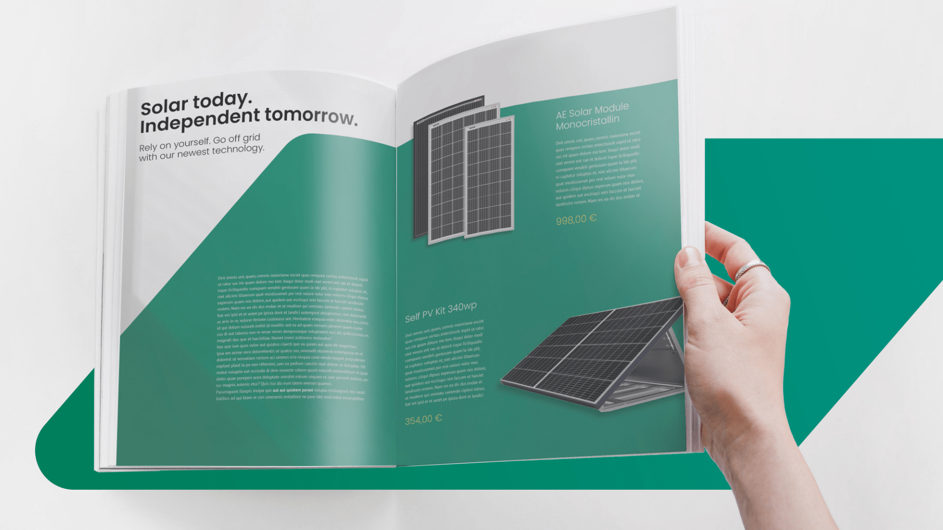
Marketing Assets
Client:
Ecoterre
Year:
2021

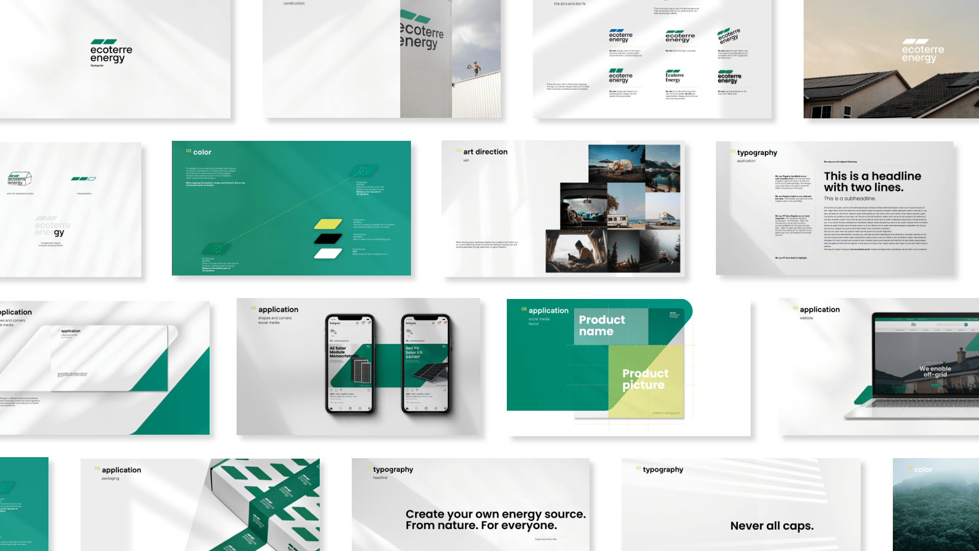
Challenge
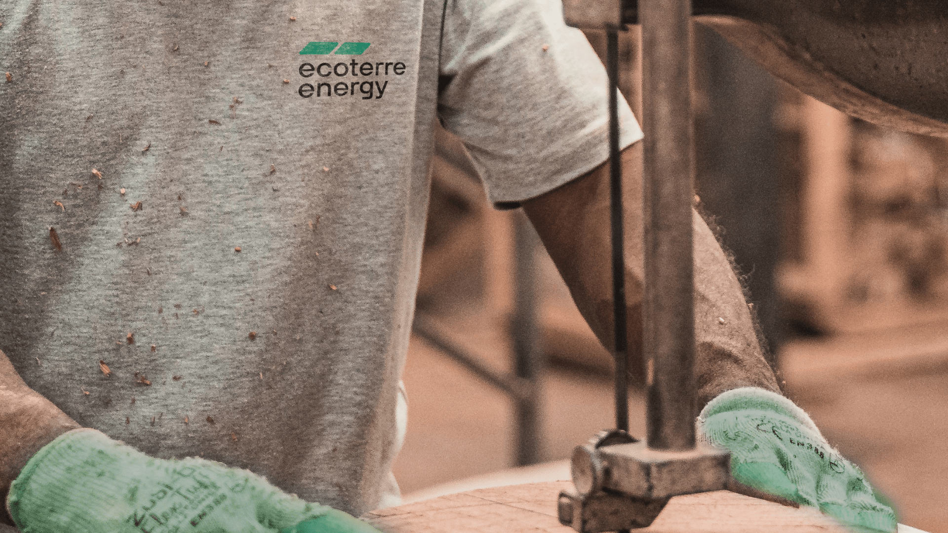
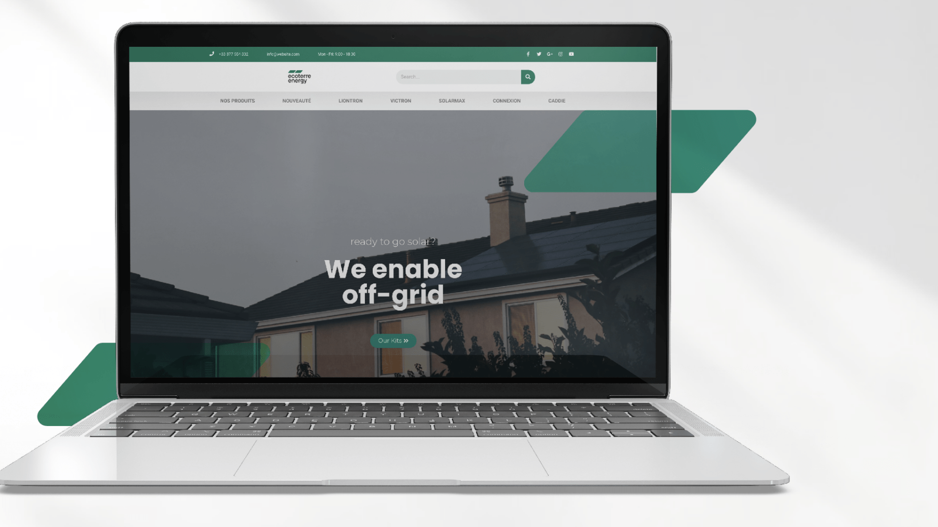
The challenge was to create a new identity and introduce new channels such as Instagram and offline prints. The existing visual identity lacked a clear structure, with no primary colors, fonts, or visual elements. We were tasked with developing a modern and appropriate brand identity that would leave a digital and trustworthy impression on customers.

Solution
In the competitor analysis, the same elements kept appearing repeatedly: suns, sunflowers, and arrows intended to symbolize electricity. To avoid these overused elements, shadows were introduced as a central design element. Following the customer analysis, it became clear that the primary customer is male, 45+, and affluent, leading to a design approach that is less playful and more focused on the essentials. An important and recurring shape is the parallelogram, symbolizing the solar panels on the roof.

No items found.


